Heat Maps for Dummies (or Smart People who Don't Know About Heat Maps)
A brief tutorial on how to create heat maps with Python
Why Do Heat Maps Matter?
A heat map is a representation of data where individual values are represented as colors, where each cell’s color represents a specific value, allowing patterns or trends to be identified intuitively and easily. There are many use cases and industries where heat maps can be useful. Industries where heat maps are regularly used include:
- Finance
- Travel
- Sports
- Healthcare
- Marketing
- Technology
- and many more
Use cases for heat maps include correlation matrixes, website heat maps, and geographic heat maps. In this tutorial we will go over the process of creating a basic 12x12 grid heat map in python using Matplotlib.
Basic Setup
For demonstration purposes we will be looking at a dataset that contains records of the annual monthly average temperatures in Aomori City, Aomori, Japan. To be clear heat maps do not have to use data involving temperatures, that is just the example I am using. The data set being used can be found here on Kaggle.com. The heat map we create will allow us to see the trends in temperature for every month across a twelve year period.
# First, I import the libraries that will be used for this tutorial
import pandas as pd
import matplotlib.pyplot as plt
import numpy as np

# Next I read in the data I will be using and make some basic changes to get it into the right format
df = pd.read_csv("temp_aomori.csv")
filtered_df = df[(df['year'] >= 2009) & (df['year'] <= 2020)]
temp_data = filtered_df.pivot('year', 'month', 'temperature')

# Fianlly we create our heat map using plt.imshow()
plt.imshow(temp_data)
plt.show()
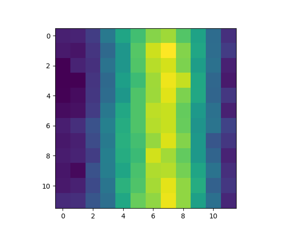
Creating a heat map is as simple as that, but of course the heat map as created above is extremely barebones. In the following section we’ll cover how to customize our heat map to make it both more aesthetically pleasing and to add more context to make it easier to understand.
Customizing the Heat Map
Here’s a look at some of the customization options available to you when making a heat map.
Shape and Color
# Read in and setup the data identically to in the Basic Setup section
import pandas as pd
import matplotlib.pyplot as plt
import numpy as np
df = pd.read_csv("C:\\Users\\natel\\Documents\\Fall2023\\temp_aomori.csv")
filtered_df = df[(df['year'] >= 2009) & (df['year'] <= 2020)
temp_data = filtered_df.pivot('year', 'month', 'temperature')

# Create a new figure with a size of 10x8 inches
plt.figure(figsize=(10, 8))

# Create a heat map as before, but this time with the added aparameter "cmap"
# cmap will change colors used in the heat map to make them more fitting for our data and more aesthetically pleasing
plt.imshow(temp_data, cmap='coolwarm')
Other options for cmap values besides coolward include jet, summer, spring, inferno, and cool. You can also create your own custom color gradients. I encourage you when making your own heat maps to experiment with coloring to maximize the ability to intuitively understand your heat map.
Colorbar
Adding a colorbar is a simple thing for us to do that makes a big difference for the reader’s ability to understand our output. The color bar informs the reader of what the colors in the heat map actually represent, and by labeling the colorbar we can add the additional context of the units being used when appropriate.
# add a colorbar
plt.colorbar(label='Temperature (°C)')
Labels
Adding a title and labeling our axes is essential because without these labels it is impossible for a reader to know what exactly they’re looking at by looking at our graph alone.
# Add a title, and label the x and y axis
plt.title('Temperature heat map (2009-2020)')
plt.xlabel('Month')
plt.ylabel('Year')

# Customize the x and y ticks to represent the months and years
# Without this step the ticks for both axis read as 0-11 instead of 2009-2020 and January-December
# We also use "rotation=45" on the xticks to make our plot more readable
plt.xticks(np.arange(len(temp_data.columns)), temp_data.columns, rotation=45)
plt.yticks(np.arange(len(temp_data.index)), temp_data.index)

plt.show()
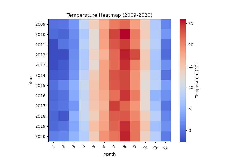
Now with all of these new customization options implemented our heat map looks much better and is much easier to understand!
Conclusion
Following this tutorial, you should now be able to make your own basic heatmaps in Python. I encourage you, the reader, to attempt to make your own heat map, as they are used in some form in almost all fields of interest for statisticians.